Any competent print designer can name a typeface at a glance. But can they name a typeface hidden in a pair of eyewear? That’s the question.
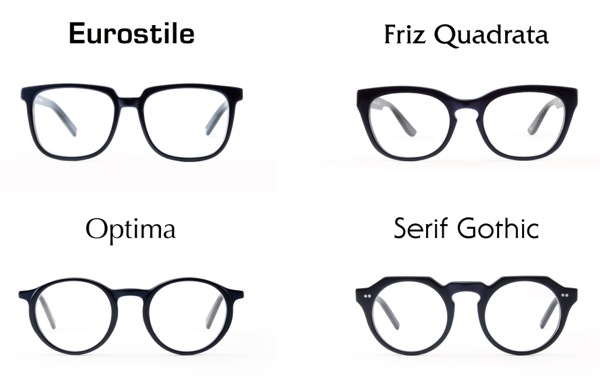
Because a new collection of glasses by ad agency Wieden+Kennedy’s Tokyo arm and retailer Oh My Glasses turns Eurostile, Optima, Friz Quadrata and Serif Gothic typefaces into wearable frames. Even better—and this is the best sort of marketing cheese—they’re available in light, regular, and bold. The collection is an expansion on the Helvetica, Garamond, and other frames released last year.
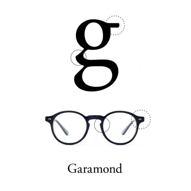
What’s so notable about the collection, however, isn’t just its irresistibly clever nomenclature. Many elements of the designs are actually lifted from features hiding in each typeface. The link of a lower case “g” makes its way into the Garamond nosepiece perfectly. Check out more here.
In other cases, it appears that the glasses are more loosely inspired by the tone of each typeface. Optima feels like it matches the vibe perfectly, even if I can’t discern the actual arms or stems of the letters playing out in the frames. But the Eurostile glasses, feel like a bit of a miss. They lack the iconic, curved rectangular symmetry of the typeface’s O, Q, and S glyphs—which would make for a more aggressive, chunky pair of glasses (something more along the lines of these). Even still, I guess saying that you own a pair of Eurostiles is still more interesting than admitting you just bought the latest release from Warby Parker.